Humans & AI branding, Microsoft

Client: Microsoft
Role: Art Director, Motion Designer
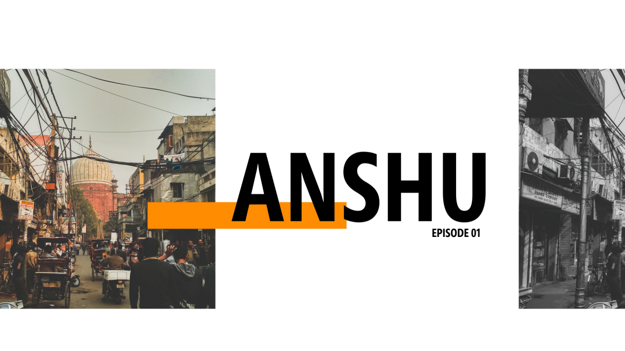
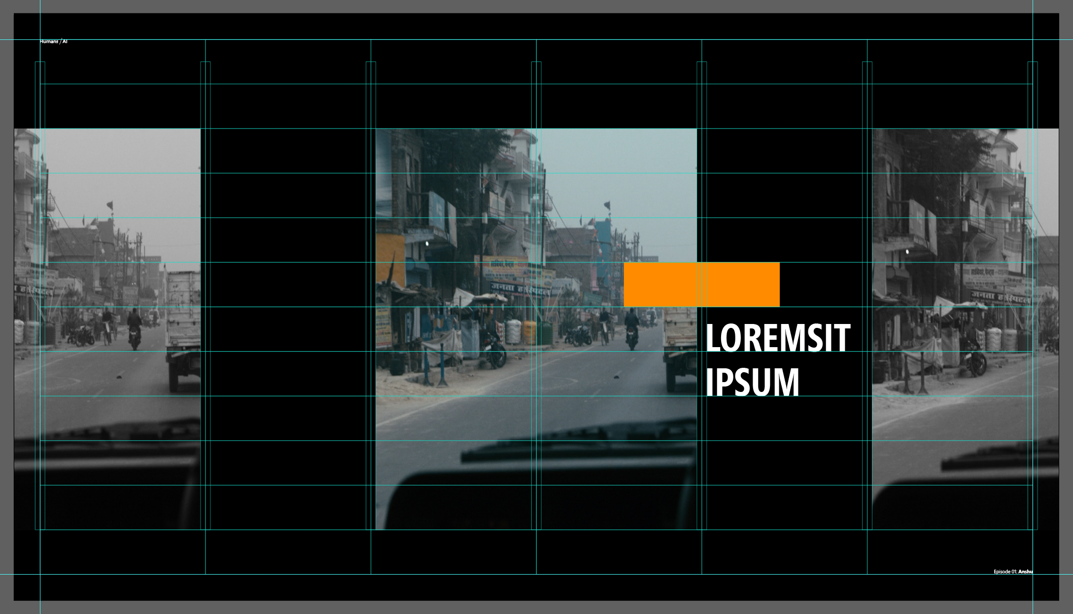
When COLOR took the reins to produce Microsoft’s Humans & AI video series I had the opportunity to develop an updated branding and motion guidelines. Given the episodal nature and tone of the series we decided to base our visuals on print editorial design. I approached the design similar to how I would a magazine layout, by creating a grid to position cropped images paired with bold text, using pops of color to lead the eye though compositions, and using typographic elements to add texture and emphasis.
Each video also featured an animated “cold open” analogous to an editorial illustration. In addition to this being an eye-catching way to start the videos, using illustration gave us complete control in setting the tone and emphasizing important themes early in the story. The motion design used simple loops to compliment the editorial style, emphasize key elements, and to fit within the quick turnarounds of the episodes. For every installment in the series we selected a color from Microsoft’s pallet to feature in the illustration as well as the title sequence and other graphics throughout the video.
It was a fun challenge working with the clients and my team to create a unique look that still meshed with Microsoft’s aesthetic. So far the updated brand for the series has been very well received.